Cambridge IELTS Writing Task 1 is a part of the book series Cambridge IELTS (with accredited sample test for IELTS Test Takers); however, there are few band 7+ sample answers or model answers for IELTS Writing Task 1 in this book. Therefore, this post collects both sample answers and model answers (band 7 or higher) for each Task 1 in these books.
If you want to learn more about IELTS Writing Task 1, check it out this series of free lessons Ultimate Guide on IELTS Writing Task 1.
Write your own answer for any task below to get feedback.

LIST OF CAMBRIDGE IELTS WRITING TASK 1
Trước khi đọc tiếp bài học ở bên dưới, bạn có thể đăng ký để nhận email hàng tuần của tôi. Tôi sẽ gửi bạn những nội dung, tips, hướng dẫn, kinh nghiệm giúp bạn học tiếng Anh và IELTS hiệu quả nhất nhé. Có rất nhiều tài liệu và bài học độc quyền tôi chỉ gửi qua email này thôi đấy. (Nếu bạn đã đăng ký, vui lòng bỏ qua nhé. Rất xin lỗi đã làm phiền bạn)
LƯU Ý!
Cảm ơn bạn đã đọc bài viết này. Mình rất mong bạn dành vài giây để đọc thông tin này nhé.
Lớp học tiếng Anh mất gốc Online English Boost sắp khai giảng giúp bạn lấy lại tự tin trước khi học IELTS, hãy nhanh tay đăng ký nhé.
Nếu bạn đang học IELTS Writing nhưng mãi chưa viết được bài hoàn chỉnh hoặc mãi chưa tăng điểm. Đó là do bạn không có người hướng dẫn chi tiết và không được chữa bài, hãy đăng ký khóa học IELTS Online Writing 1-1 với đặc trưng là tất cả bài viết đều được chữa chi tiết nhiều lần bởi giáo viên và cựu giám khảo, đã giúp tăng 0.5 chấm trong 2 tuần.
Nếu bạn đang gặp khó khăn khi bắt đầu việc học IELTS 4 kỹ năng đừng tự mò mẫm nữa. Để tiết kiệm thời gian và chi phí, bạn có thể đăng ký ngay khóa học IELTS Online Completion 4 kỹ năng để học từ cơ bản tới nâng cao, với chi phí thấp, có tương tác trực tiếp rất nhiều với giáo viên, đã giúp rất nhiều bạn đạt 6.5 – 8.0 chỉ với chi phí cực ít.
Nếu bạn đang luyện thi IELTS Speaking và Writing mà gặp khó khăn với từ vựng do quá nhiều chủ đề và quá nhiều từ vựng cần học. Nếu bạn không biết nên ôn Reading và Listening thế nào. Bạn nên sử dụng bộ đề IELTS Dự Đoán Mỳ Ăn Liền có kèm đáp án chi tiết đầy đủ cũng như các giới hạn đề thi. Đề cập nhật thường xuyên giúp bạn ôn thi tốt hơn.
Cảm ơn bạn đã dành thời gian xem thông tin.
SAMPLE ANSWER AND MODEL ANSWER FOR cambridge IELTS Writing Task 1 BOOK 5
Following are sample and model answers (band 7 or higher) for IELTS Cambridge Book 5
IELTS CAMBRIDGE 5 TEST 1
You should spend about 20 minutes on this task.
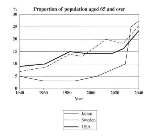
The graph below shows the proportion of the population aged 65 and over between 1940 and 2040 in three different countries.
Summarise the information by selecting and reporting the main features, and make comparison where relevant.
Write at least 150 words.
MODEL ANSWER by Examiners
The graph shows the increase in the ageing population in Japan, Sweden the USA. It indicates that the percentage of elderly people in all three countries is expected to increase to almost 25% of the respective populations by the year 2040.
In 1940 the proportion of people aged 65 or more stood at only 5% in Japan, approximately 7% in Sweden and 9% in the US. However, while the figures for the Western countries grew to about 15% in around 1990, the figure for Japan dipped to only 2.5% for much of this period, before rising to almost 5% again at the present time.
In spite of some fluctuation in the expected percentages, the proportion of older people will probably continue to increase in the next two decades in the three countries. A more dramatic to rise is predicted between 2030 and 2040 in Japan, by which time it is thought that the proportion of elderly people will be similar in the three countries.
SAMPLE ANSWER
A NORMAL ESSAY
The graph compares the proportion of the 65 and over aged population from 1940 to 2040 in 3 countries. The population in Sweden, Japan and the USA are ageing and Japanese population is predicted to be younger than 2 other ones.
In 1940, there were just under 10% of American who were 65 or above, and this number gradually increased to 15% in next 40 years. At the same time, the 65-and-over-year-old population of Sweden was lower than those of the USA, and they grew similarly; however, the population aged 65 and over of Japan slightly decreased by 2.5% and recovered to 5% until 2000.
From 2000, it is predicted that Swedish population will become older than American, and Japanese aged population will suddenly boom and will become oldest among 3 countries. In 2040, people aged 65 and over accounted for a quarter of total population in 3 countries.
A FREESTYLE VERSION OF MY STUDENT WHO GOT BAND 8 IN IELTS WRITING
It is predicted that the population in Sweden, Japan and the USA are ageing and the given period saw the raise of aged population in Japan.
In 1940, 10% of American population was 65 and over, and this number in Sweden and Japan was around 5%. While the proportion of older people in the US and Sweden grew to around 15% in 2000, the figure for Japan slightly went down and went up again.
Since 2000, Swedish population is predicted to be older than American population and probably continue to increase in the next 40 years. However, the proportion of older people in Japan is predicted to dramatically rise from 2030, and Japanese population will become the oldest among 3 countries in the late 2030. In 2040, it is thought that the proportion of the population aged 65 and more in these countries will be similar at around 25%.
IELTS CAMBRIDGE 5 TEST 2
You should spend about 20 minutes on this task.
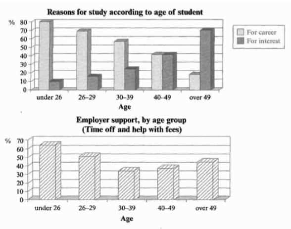
The chart below show the main reasons for study among students of different age groups and the amount of support they received from employers.
Summarise the information by selecting and reporting the main features, and make comparison where relevant.
Write at least 150 words.
SAMPLE ANSWER BAND 7
Younger students study mainly for career rather than study for interest, and they receive more support from employers than older students.
Nearly 80% of students aged under 26 study for career, and this figure is the highest in the graph. Also, this youngest group received the highest support from their employer, with 70% support, but the support is cut off by age. Career purpose as the main reason for study becomes less important while there is a gradual increase in study for interest by age.
The percentages of students studying for career and interest are the same at the age of 40 to 49, and students at this aged group and 30-39 age group received the least employer support. Although the support from employer grows again, only nearly 20% of students aged 49 and over study for career but interest becomes the main study purpose for study in late adulthood.
SAMPLE ANSWER BAND 8 (FROM CAMBRIDGE IELTS 5)
SAMPLE ANSWER TỪ BỘ ĐỀ CAM – BAND 8
A wide range of structures is used and most sentences in this answer are accurate. Errors are rate and do not affect communication in this answer.
The first graph shows that there is a gradual decrease in study for career reasons with age. Nearly 80% of students under 26 years, study for their career. This percentage gradually declines by 10-20% every decade. Only 40% of 40-49 yr olds and 18% of over 49 yr olds are studying for career reasons in late adulthood.
Conversely, the first graph also shows that study stemming from interest increases with age. There are only 10% of under 26 yr olds studying out of interest. The percentage increases slowly till the beginning of the fourth decade, and increases dramatically in late adulthood. Nearly same number of 40-49 yr olds study for career and interest. However 70% of over 49 yr olds study for interest in comparison to 18% studying or career reasons in that age group.
The second graph shows the that employer support is maximum ( approximately 60%) for the under 26 yr students. It drops rapidly to 32% up to the third decade of life, and then increases in late adulthood up to about 44%. It is unclear whether employer support is only for career-focused study, but the highest level is for those students who mainly study for career purposes.
IELTS CAMBRIDGE 5 TEST 3
You should spend about 20 minutes on this task.
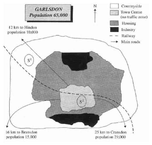
The map below is of the town of Garlsdon. A new supermarket ( S ) is planned for the town. The map shows two possible sites for the supermarket.
Summarise the information by selecting and reporting the main features, and make comparison where relevant.
Write at least 150 words.
MODEL ANSWER
The map shows two proposed locations for a new supermarket for the town of Garlsdon. Overall, neither site is appropriate for all the towns, but for customers in Cransdon, Hindon and Bransdon, the out-of-town site (S1) would probably offer more advantages.
The first potential location (S1) is outside the town itself, and is sited just off the main road to the town of Hindon, lying 12 kms to the north-west. This site is in the countryside and so would be able to accommodate a lot of car parking. This would make it accessible to shoppers from both Hindon and Garisdon who could travel by car. As it is also close to the railway line linking the two towns to Cransdon (25 km to the south-east), a potentially large number of shoppers would be able to travel by train.
In contrast, the suggested location, S2, is right in the town center, which would be good for local residents. Theoretically the store could be accessed by road or rail from the surrounding towns, including Bransdon, but as the central area is a no-traffic zone, cars would be unable to park and access would be difficult.
SAMPLE ANSWER (SHORT VERSION)
The basic difference between 2 potential locations, S1 and S2, for building a new supermarket in Garlsdon town is that S1 is on the outskirts while S2 is in the town centre. S1 would be built in the countryside and in the north west of Garlson; in contrast, S2 is in the south of the town centre. Both of them are close to the residential area which surrounds the town centre and is surrounded by the countryside.
They also differ with regard to access by road and train and their relative position with three other towns. The centre of Garlsdon is connected with Hindon, Bransdon and Cransdon by main roads but traffic is not allowed in the town centre. This means that there will be no access to S2. However, S1 is accessible by road from Hindon, laying 12 kms to the north-west of Garlsdon. Both these locations are sited just off the railway that runs through Garlsdon from Hindon to Cransdon.
IELTS CAMBRIDGE 5 TEST 4
You should spend about 20 minutes on this task.
The table below gives information about the underground railway systems in six cities.
Summarise the information by selecting and reporting the main features, and make comparison where relevant.
Write at least 150 words.
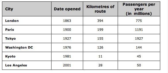
SAMPLE ANSWER
Overall, three older underground railway systems are larger in size and the number of people who use them than three newer ones.
Opening in 1863, the London’s underground system is the oldest and the most extensive system with 394 kilometres of route. The second oldest system, Paris, is just half the size of the London system, but it carries more passengers each year. Although the Tokyo’s system is newer than these 2 systems, it serves the greatest number of passenger with 1927 million people per year.
Among the newer systems, the Washington DC underground railway system is opened sooner and larger than 2 others; also, it serves more people per year. The Kyoto system is smallest with 11 kilometres of route and serve a smallest number of passenger per year with 45 million while the Los Angeles system is the newest but larger and more used than Kyoto’s one.
SAMPLE ANSWER (FROM CAMBRIDGE BAND 7)
The table shows the details regarding the underground railway systems in six cities.
London has the oldest underground railway systems among the six cities. It was opened in the year 1863, and it is already 140 years old. Paris is the second oldest, in which it was opened in the year 1900. This was then followed by the opening of the railway systems in Tokyo, Washington DC and Kyoto. Los Angeles has the newest underground railway systems, and was only opened in the year 2001. In terms of the size of the railway systems, London, for certain, has the largest underground railway systems. It has 394 kilometres of route in total, which is nearly twice as large as system in Paris. Kyoto, in contrast, has the smallest system. It only has 11 kilometres of route, which is more than 30 times less than that of London.
Interestingly, Tokyo, which only has 155 kilometres of route, serves the greatest number of passengers per year, at 1927 millions passengers. The system in Paris has the second greatest number of passengers, at 1191 millions passengers per year. The smallest underground railway system, Kyoto, serves the smallest number of passengers per year as predicted.
In conclusion, the underground railway systems in different cities vary a lot in the size of the system, the number of passengers served per year and in the age of the system.
SAMPLE ANSWER AND MODEL ANSWER FOR IELTS CAMBRIDGE BOOK 6
Following are sample and model answers (band 7 or higher) for IELTS Cambridge Book 6
IELTS CAMBRIDGE 6 TEST 1
You should spend about 20 minutes on this task.
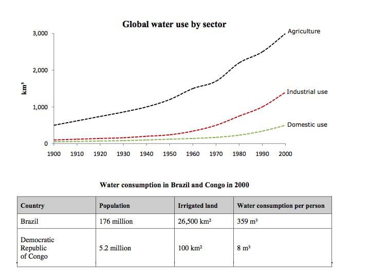
The graph and table below give information about water use worldwide and water consumption in two different countries.
Summarise the information by selecting and reporting the main features, and make comparison where relevant.
Write at least 150 words.
MODEL ANSWER by Examiners
The graph shows how the amount of water used worldwide changed between 1900 and 2000.
Throughout the century, the largest quantity of water was used for agricultural purposes, and this increased dramatically from about 500 km3 to around 3,000 km3 in the year 2000. Water used in the industrial and domestic sectors also increased, but consumption was minimal until mid-century. From 1950 onwards, industrial use grew steadily to just over 1,000 km3, while domestic use rose more slowly to only 300 km3, both far below the levels of consumption by agriculture.
The table illustrates the differences in agricultural consumption in some areas of the world by contrasting the amount of irrigated land in Brazil (26,500 km2) with that In the D.R.C. (100 km2), This means that a huge amount of water is used in agriculture in Brazil, and this is reflected in the figures for water consumption per person: 359 m3 compared with only 8m3 in the Congo. With population of 176 million, the figures for Brazil indicate how high agricultural water consumption can be in some countries.
SAMPLE ANSWER
The given graph shows the purposes of water used globally while the table compares the water consumption in Brazil and Congo in 2000.
All over the world, the demand for water used increased in all 3 sectors: agriculture, industry and domestic, during 20th century. The largest quantity of water was used globally for agricultural purpose, and this grew dramatically from 500 to 3000 km3 and was by far higher than the use of water for 2 other purposes. Before mid-century, the use of water in industry and domestic was minimal. In the last 50 years, the industrial use of water rose steadily to 1000 while the water usage for domestic use went up slowly to just a half of industrial use.
Looking at the table, the water used in Brazil was by far higher than that in Congo. With a larger land for agriculture (26.500) and population (176 million), each Brazilian consumed 359 m3 in 200. In contrast, the water use per capita in Congo was 8 m3, and this reflects the by far smaller population and irrigated land of this country in comparison with Brazil.
IELTS CAMBRIDGE 6 TEST 2
You should spend about 20 minutes on this task.
The table below gives information about changes in modes of travel in England between 1985 and 2000.
Summarise the information by selecting and reporting the main features, and make comparison where relevant.
Write at least 150 words.
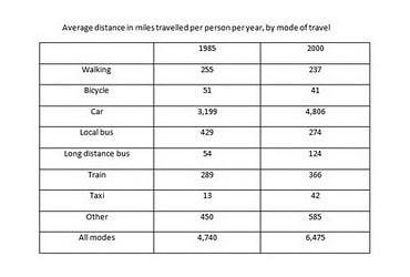
SAMPLE ANSWER BAND 7
IELTS CAMBRIDGE 6 TEST 3
You should spend about 20 minutes on this task.
The diagrams below show the life cycle of the silkworm and the stages in the production of silk cloth.
Summarise the information by selecting and reporting the main features, and make comparison where relevant.
Write at least 150 words.
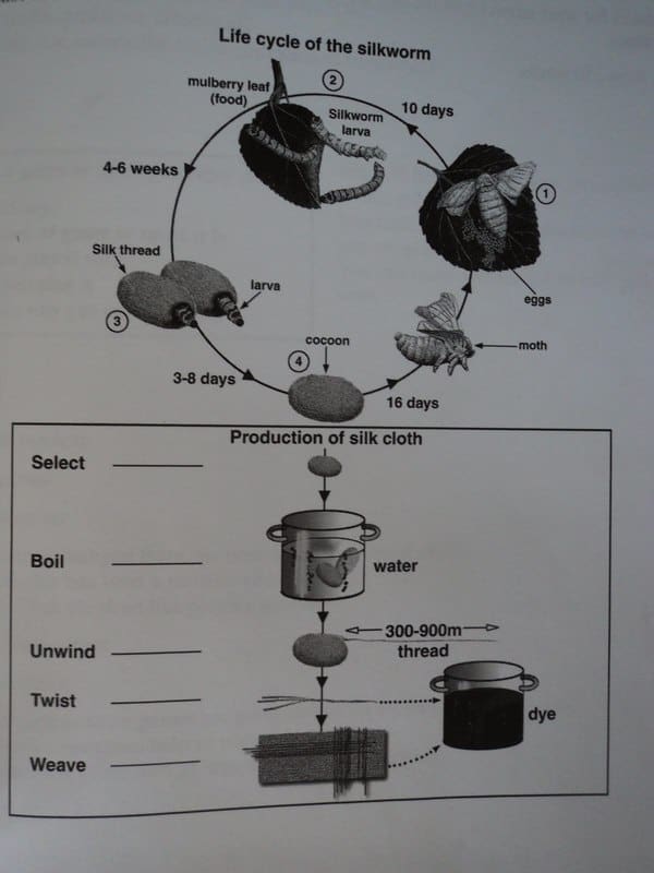
MODEL ANSWER
The first diagram illustrates the silkworm’s life cycle and the second shows how silk cloth is produced. Overall, the life cycle of silkworms can be interrupted as they can be used to facilitate the production of silk cloth.
Regarding to the life of silkworm, the silkworm moth lays eggs on mulberry leaves. After 10 days, the silkworm larvae hatch (breaks the eggs to come out) and use mulberry leaves as food source for themselves during 4 – 6 weeks. After this time, the larvae spend 3 – 8 days to spin (make) silk threads from cocoon to stay inside. From this stage, some cocoons will be used to produce silk cloth, if being selected. If they are not appropriate for silk cloth production, they go through 16-day-stage of developing and then fully developed silkworm moths hatch to begin their life cycle again.
The production of silk cloth begins with selected cocoons, then these are boiled in water. Thereafter, each boiled cocoon is unwound so that there is thread with 300 – 900 m in length produced. Afterwards, it is twisted or weaved and then dyed to complete silk cloth.
IELTS CAMBRIDGE 6 TEST 4
You should spend about 20 minutes on this task.
The charts below give the information about USA marriage and divorce rates between 1970 and 2000, and the marital status of adult Americans in two of the years.
Summarise the information by selecting and reporting the main features, and make comparison where relevant.
Write at least 150 words.
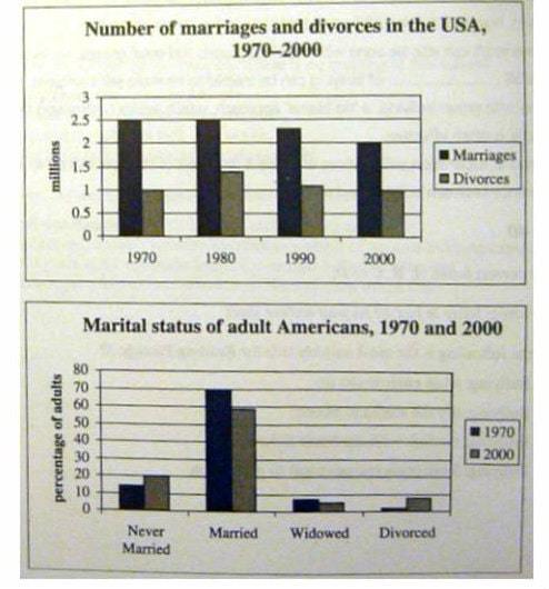
SAMPLE ANSWER
The 2 charts compare the number of married and divorced American and the marital status of adult in the USA. Overall, despite its decrease, marriages and married life still were popular among American people.
In 1970, there were 2.5 million of American marriages, and this number was by far higher than that of divorces in the USA (1 million). In the next 30 years, while the number of marriages decreased gradually, the number of people who divorced during this time was generally unchanged. However, the marriages still higher than the divorces.
In 1970, 70% of American adults was married, then it had fallen to just under 60%. The percentage of this status among American adults was extremely higher than that of other married status. While the percentage of single people (who never married) increased slightly from 10% to 20%, the percentage of widowed and divorced people was just under 10%.
SAMPLE ANSWER AND MODEL ANSWER FOR IELTS CAMBRIDGE BOOK 7
Following are sample and model answers (band 7 or higher) for Cambridge IELTS Writing Task 1 Book 7
IELTS CAMBRIDGE 7 TEST 1
You should spend about 20 minutes on this task.
The table below gives information on consumer spending on different items in five different countries in 2002.
Summarise the information by selecting and reporting the main features, and make comparisons where relevant.
Write at least 150 words.
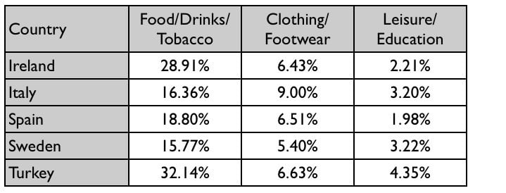
SAMPLE ANSWER
The table shows percentages of consumer expenditure for three categories of products and services in five countries in 2002. It is clear that the largest proportion of consumer spending in each country went on food, drinks and tobacco. On the other hand, the leisure/education category has the lowest percentages in the table.
Out of the five countries, consumer spending on food, drinks and tobacco was noticeably higher in Turkey, at 32.14%, and Ireland, at nearly 29%. The proportion of spending on leisure and education was also highest in Turkey, at 4.35%, while expenditure on clothing and footwear was significantly higher in Italy, at 9%, than in any of the other countries.
It can be seen that Sweden had the lowest percentages of national consumer expenditure for food/drinks/tobacco and for clothing/footwear, at nearly 16% and just over 5% respectively. Spain had slightly higher figures for these categories, but the lowest figure for leisure/education, at only 1.98%.
IELTS CAMBRIDGE 7 TEST 2
You should spend about 20 minutes on this task.
The graph below shows the consumption of fish and name different kinds of meat in a European countries between 1979 and 2004.
Summarise the information by selecting and reporting the main features, and make comparisons where relevant.
Write at least 150 words.
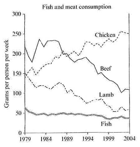
MODEL ANSWER
The graph illustrates changes in the amounts of beef, lamb, chicken and fish consumed in a particular European country between 1979 and 2004.
In 1979 beef was by far the most popular of these foods, with about 225 grams consumed per person per week. Lamb and chicken were eaten in similar quantities (around 150 grams), while much less fish was consumed (just over 50 grams).
However, during this 25-year period the consumption of beef and lamb fell dramatically to approximately 100 grains and 55 grams respectively. The consumption of fish also declined, but much less significantly to just below 50 grams, so although it remained the least popular food, consumption levels were the most stable.
The consumption of chicken, on the other hand, showed an upward trend, overtaking that of Iamb in 1980 and that of beef in 1989. By 2004 it had soared to almost 250 grams per person per week.
Overall, the graph shows how the consumption of chicken increased dramatically while the popularity of these other foods decreased over the period.
SAMPLE ANSWER
The graph shows the amount of fish and 3 types of meat consumed in a European country from 1979 to 2004. Overall, during this period, chicken had become more preferred while others type of food was less preferred.
In 1979, people in this country preferred beef the most with more than 200 grammes of beef consumed daily by each person. Each person ate 150 grammes of chicken and lambs while just over 50 grammes of fish was consumed this year. Over the period, while the consumption of beef and lamb decreased significantly, people preferred chicken, and the consumption increased. Since 1989, the amount of chicken consumed had been higher than that of beef. The fish consumption remained almost the same throughout the years.
In 2004, the daily consumption of beef was 100 grammes, and the fish and lamb consumption were nearly the same at around 50 whereas the consumption of fish reached to over 250 grammes.
IELTS CAMBRIDGE 7 TEST 3
You should spend about 20 minutes on this task.
The chart below shows information about changes in average house process in five different cities between 1990 and 2002 compared with the average house prices in 1989.
Summarise the information by selecting and reporting the main features, and make comparisons where relevant.
Write at least 150 words.
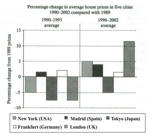
MODEL ANSWER
The bar chart compares the cost of an average house in five major cities over a period of 13 years from 1989.
We can see that house prices fell overall between 1990 and 1995, but most of the cities saw rising prices between 1996 and 2002. London experienced by far the greatest changes in house prices over the 13-year period.
Over the 5 years after 1989, the cost of average homes in Tokyo and London dropped by around 7%, while New York house prices went down by 5%. By contrast, prices rose by approximately 2% in both Madrid and Frankfurt.
Between 1996 and 2002, London house prices jumped to around 12% above the 1989 average. Homebuyers in New York also had to pay significantly more, with prices rising to 5% above the 1989 average, but homes in Tokyo remained cheaper than they were in 1989. The cost of an average home in Madrid rose by a further 2%, while prices in Frankfurt remained stable.
(165 words)
IELTS CAMBRIDGE 7 TEST 4
You should spend about 20 minutes on this task.
The pie charts below show the units of electricity production by fuel source in Australian and France in 1980 and 2000.
Summarise the information by selecting and reporting the main features, and make comparisons where relevant.
Write at least 150 words.
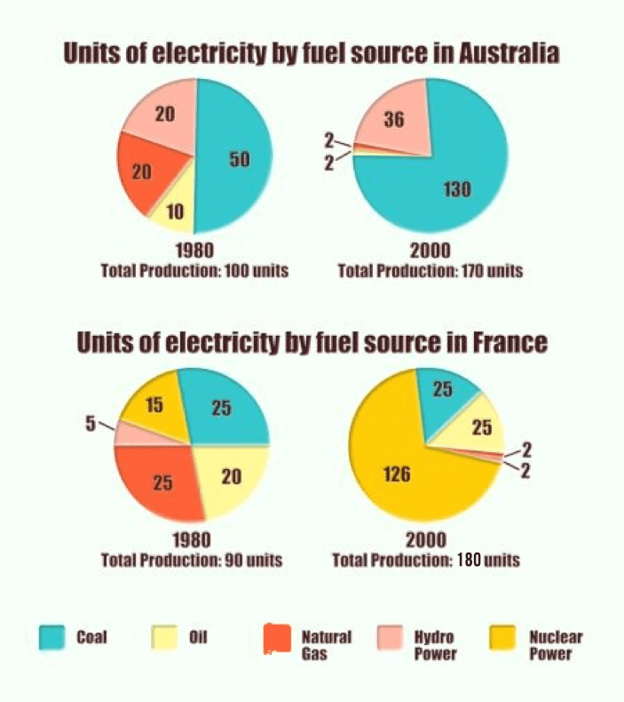
SAMPLE ANSWER
Version 1
The pie charts compare the amount of electricity produced using five different sources of fuel in two countries over two separate years.
Total electricity production increased dramatically from 1980 to 2000 in both Australia and France. While the totals for both countries were similar, there were big differences in the fuel sources used.
Coal was used to produce 50 of the total 100 units of electricity in Australia in 1980, rising to 130 out of 170 units in 2000. By contrast, nuclear power became the most important fuel source in France in 2000, producing almost 75% of the country’s electricity.
Australia depended on hydro power for just under 25% of its electricity in both years, but the amount of electricity produced using this type of power fell from 5 to only 2 units in France. Oil, on the other hand, remained a relatively important fuel source in France, but its use declined in Australia. Both countries relied on natural gas for electricity production significantly more in 1980 than in 2000.
(170 words)
Version 2
The charts compare the sources of electricity in Australia and France in the years 1980 and 2000. Between these years electricity production almost doubled, rising from 100 units to 170 in Australia, and from 90 to 180 units in France.
In 1980 Australia used coal as the main electricity source (50 units) and the remainder was produced from natural gas, hydro power (each producing 20 units) and oil (which produced only 10 units). By 2000, coal had become the fuel for more than 75% of electricity produced and only hydro continued to be another significant source supplying approximately 20%.
In contrast, France used coal as a source for only 25 units of electricity in 1980, which was matched by natural gas. The remaining 40 units were produced largely from oil and nuclear power, with hydro contributing only 5 units. But by 2000 nuclear power, which was not used at all in Australia, had developed into the main source, producing almost 75% of electricity, at 126 units, while coal and oil together produced only 50 units. Other sources were no longer significant.
Overall, it is clear that by 2000 these two countries relied on different principal fuel sources: Australia relied on coal and France on nuclear power.
SAMPLE ANSWER AND MODEL ANSWER FOR IELTS CAMBRIDGE BOOK 8
Following are sample and model answers (band 7 or higher) for Cambridge IELTS Writing Task 1 Book 8
IELTS CAMBRIDGE 8 TEST 1
You should spend about 20 minutes on this task.
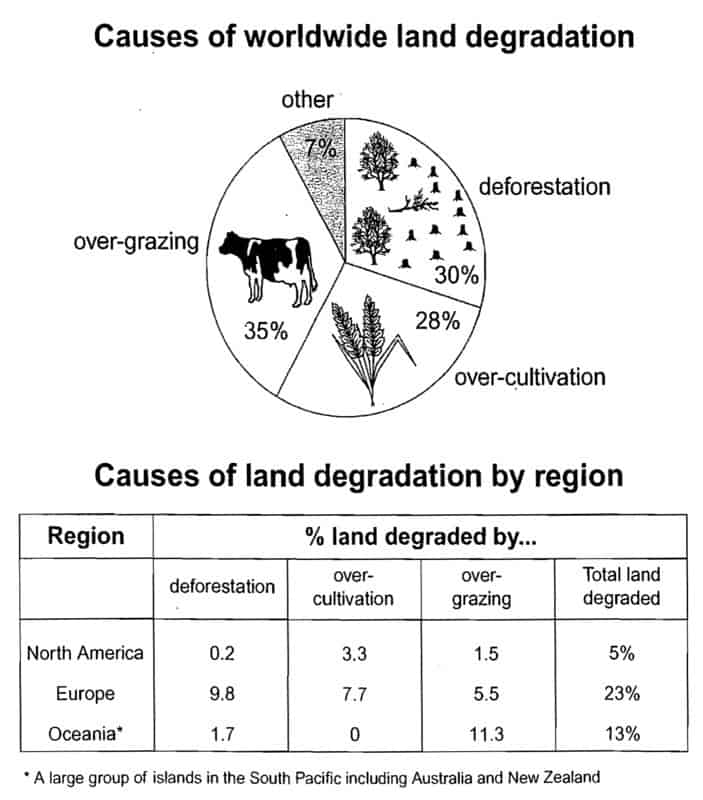
The pie chart below shows the main reasons why agricultural land becomes less productive. The table shows how these effected three regions of the world during the 1990s.
Summarise the information by selecting and reporting the main features, and make comparisons where relevant.
Write at least 150 words.
MODEL ANSWER
The pie chart shows that there are four main causes of farmland becoming degraded in the world today. Globally, 65% of degradation is caused by too much animal grazing and tree clearance, constituting 35% and 30% respectively. A further 28% of global degradation is due to over-cultivation of crops. Other causes account for only 7% collectively.
These causes affected different regions differently in the 1990s, with Europe having as much as 9.8% of degradation due to deforestation, while the impact of this on Oceania and North America was minimal, with only 1.7% and 0.2% of land affected respectively. Europe, with the highest overall percentage of land degraded (23%), also suffered from over-cultivation (7.7%) and over-grazing (5.5%). In contrast, Oceania had 13% of degraded farmland and this was mainly due to over-grazing (11.3%). North America had lower proportion of degraded land at only 5%, and the main causes of this were over-cultivation (3.3%) and, to a lesser extent, over-grazing (1.5%).
Overall, it is clear that Europe suffered more from farmland degradation than the other regions, and the main causes there were deforestation and over-cultivation.
IELTS CAMBRIDGE 8 TEST 2
You should spend about 20 minutes on this task.
The three pie charts below show the changes in annual spending by the particular UK school in 1981, 1991 and 2001.
Summarise the information by selecting and reporting the main features, and make comparisons where relevant.
Write at least 150 words.
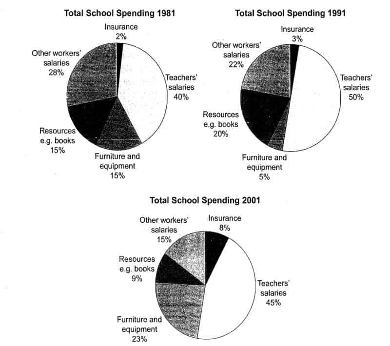
MODEL ANSWER
The charts show how much a UK school spent on different running costs in three separate years: 1981, 1991 and 2001.
In all three years, the greatest expenditure was on staff salaries. But while other workers’ salaries saw a fall from 28% in 1981 to only 15% of spending in 2001, teachers’ pay remained the biggest cost, reaching 50% of total spending in 1991 and ending at 45% in 2001.
Expenditure on resources such as books had increased to 20% by 1991 before decreasing to only 9% by the end of the period. In contrast, the cost of furniture and equipment saw an opposite trend. This cost decreased to only 5% of total expenditure in 1991 but rose dramatically in 2001 when it represented 23% of the school budget. Similarly, the cost of insurance saw a rising trend, growing from only 2% to 8% by 2001.
Overall, teachers’ salaries constituted the largest cost to the school, and while spending increased dramatically for equipment and insurance, there were corresponding drops in expenditure on things such as books and on other workers’ salaries.
IELTS CAMBRIDGE 8 TEST 3
You should spend about 20 minutes on this task.
The diagram below show the stages and equipment used in the cement-making process, and how cement is used to produce concrete for building purposes.
Summarise the information by selecting and reporting the main features, and make comparisons where relevant.
Write at least 150 words.
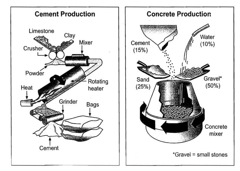
MODEL ANSWER
Version 1
The diagrams illustrate the way in which cement is made and how it is then used in the process of making concrete. Overall, limestone and clay pass through four stages before being bagged ready for use as cement which then accounts for 15% of the four materials used to produce concrete. While the process of making cement uses a number of tools, the production of concrete requires only a concrete mixer.
In the first stage of making cement, limestone and clay are crushed together to form a powder. This powder is then combined in a mixer before passing into a rotating heater which has constant heat applied at one end of the tube. The resulting mixture is ground in order to produce cement. The final product is afterwards put into bags ready to be used.
Regarding the second diagram, concrete consists of mainly gravel, which is small stones, and this makes up 50% of the ingredients. The other materials used are sand (25%), cement (15%) and water (10%). These are all poured into a concrete mixer which continually rotates to combine the materials and ultimately produces concrete.
Version 2
The first diagram illustrates the process of cement manufacture, and the second diagram shows the materials that go into the production of concrete.
It is clear that there are five stages in the production of cement, beginning with the input of raw materials and ending with bags of the finished product. To produce concrete, four different materials are mixed together.
At the first stage in the production of cement, limestone and clay are crushed to form a powder. This powder is then mixed before it passes into a rotating heater. After heating, the resulting mixture is ground, and cement is produced. Finally, the cement is packaged in large bags.
Cement is one of the four raw materials that are used in the production of concrete, along with gravel, sand and water. To be exact, concrete consists of 50% gravel, 25% sand, 15% cement and 10% water. All four materials are blended together in a rotating machine called a concrete mixer.
IELTS CAMBRIDGE 8 TEST 4
You should spend about 20 minutes on this task.
The three pie charts below show the changes in annual spending by the particular UK school in 1981, 1991 and 2001.
Summarise the information by selecting and reporting the main features, and make comparisons where relevant.
Write at least 150 words.
SAMPLE ESSAY BAND 8 (FROM IELTS CAMBRIDGE)
Sample Answer (Band 8)
The graph illustrates the quantities of goods transported in the United Kingdom by four different modes of transport between the time period of 1974 and 2002. Over this span of 28 years, the quantities of goods transported by road, water and pipeline have all increased while the quantity transported by rail has remained almost constant at about 40 million tonnes.
The largest quantity of goods transported both in 1974 and 2002 was by road (70 million tonnes and 98 million tonnes respectively) while the lowest both in 1974 and 2002 was by pipeline (about 5 million tonnes and 22 million tonnes respectively). The amount of goods transported by water was constant from 1974 to 1978, where it showed an exponential growth, rising to almost 60 million tonnes after which it plateaued for about 20 years before starting to rise gradually again.
The amount of goods transported by rail is almost constant at 40 million tonnes in 1974 and 2002, with decreases in quantity in between the years. It is also interesting to note that almost all showed a decrease in 1994 in amount of goods transported except for the pipeline, which actually peaked in that year.
In conclusion the road remains the most popular method of transporting goods in the UK while water and pipelines are becoming increasingly used, have not become more popular as a method of transport.
230 Words
SAMPLE ANSWER AND MODEL ANSWER FOR CAMBRIDGE IELTS WRITING TASK 1 BOOK 9
Following are sample and model answers (band 7 or higher) for Cambridge IELTS Writing Task 1 Book 9
CAMBRIDGE IELTS WRITING TASK 1 BOOK 9 TEST 1
You should spend about 20 minutes on this task.
The two maps below show an island, before and after the construction of some tourist facilities.
Summarize the information by selecting and reporting the main features, and make comparisons where relevant.
Write at least 150 words .
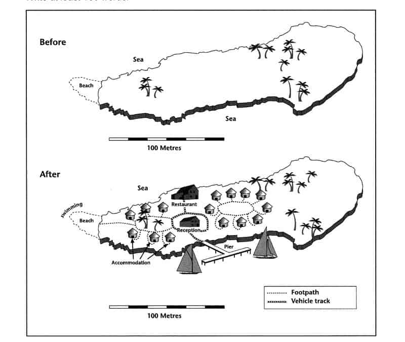
SAMPLE ANSWER
The 2 given maps show how an island had been developed with the construction of some tourist facilities. Generally speaking, the main development was that visitors had somewhere to stay and this development had no impact on the natural landscape of the island that much.
Before the construction, there was only trees on the east and middle and a beach on the left of the island which is 1000 meters in length.
Afterwards, the most noticeable feature is that all trees was kept. a pier was built to land boats in the south so that the island can be accessed. From pier, tourists can go to the reception building and then a restaurant in the middle of the island by vehicle. Some of accommodation buildings, bungalows alike, was built in the middle of the land and some near the beach, all of them was connected to each other and to the reception by footpath. Therefore, they can walk to accommodation to stay and to the beach where they are allowed to swim now.
IELTS CAMBRIDGE 9 TEST 2
You should spend about 20 minutes on this task.
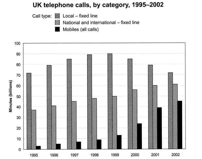
The chart below shows the total number of minutes (in billions) of telephone calls in the UK, divided into three categories, from 1995-2002.
Summarize the information by selecting and reporting the main features, and make comparisons where relevant.
Write At least 150 words.
MODEL ANSWER
The chart shows the time spent by UK residents on different types of telephone calls between 1995 and 2002.
Local fixed line calls were the highest throughout the period, rising from 72 billion minutes in 1995 to just under 90 billion in 1988. After peaking at 90 billion the following year, these calls had fallen back to the 1995 figure by 2002.
National and international fixed line calls grew steadily from 38 billion to 61 billion at the end of the period in question, though the growth slowed over the last two years.
There was a dramatic increase in mobile calls from 2 billion to 46 billion minutes. This rise was particularly noticeable between 1999 and 2002, during which time the use of mobile phones tripled.
To sum up, although local fixed line calls were still the most popular in 2002, the gap between the three categories had narrowed considerably over the second half of the period in question.
164 Words
IELTS CAMBRIDGE 9 TEST 3
You should spend about 20 minutes on this task.
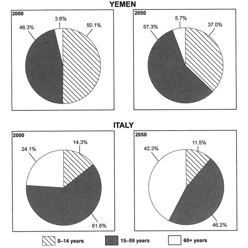
The chart below give information on the ages of the populations of Yemen and Italy in 2000 and projections for 2050.
Summarize the information by selecting and reporting the main features, and make comparisons where relevant .
Write At least 150 words.
MODEL ANSWER
Model answer from ielts-simon.com
The pie charts compare the proportions of people falling into three distinct age groups in Yemen and Italy in two different years. It is clear that Italy had the older population in the year 2000, and that the same is predicted for the year 2050. The populations of both countries are expected to age over the fifty-year period.
In the year 2000, just over half of the population of Yemen was aged 14 or under, while most Italians (61.6%) fell into the 15 to 59 age group, and only 14.3% were children under 15 years of age. People aged 60 or over accounted for almost a quarter of the Italian population, but only 3.6% of the inhabitants of Yemen.
By 2050, the proportion of children under 15 is predicted to drop in both countries, most noticeably in Yemen where the figure is expected to fall by 13.1%. On the other hand, the figures for elderly people are expected to rise, by 2.1% in Yemen and a massive 18.2% in Italy. Finally, it is anticipated that the 15 to 59 age group will grow by around 10% inYemen, but shrink by around 15% in Italy.
IELTS CAMBRIDGE 9 TEST 4
You should spend about 20 minutes on this task.
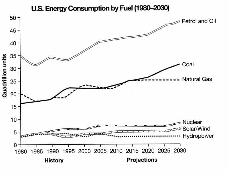
The chart below gives the information from a 2008 report about consumption of energy in a USA since 1980 with projections until 2030.
Summarize the information by selecting and reporting the main features, and make comparisons where relevant.
Write At least 150 words.
MODEL ANSWER
The graph shows energy consumption in the US from 1980 to 2012, and projected consumption to 2030.
Petrol and oil are the dominant fuel sources throughout this period, with 35 quadrillion (35q) units used in 1980, rising to 42q in 2012. Despite some initial fluctuation, from 1995 there was a steady increase. This is expected to continue, reaching 47q in 2030.
Consumption of energy derived from natural gas and coal is similar over the period. From 20q and 15q respectively in 1980, gas showed an initial fall and coal a gradual increase, with the two fuels equal between 1985 and 1990. Consumption has fluctuated since 1990 but both now provide 24q. coal is predicted to increase steadily to 31q in 2030, whereas after 2014, gas will remain stable at 25q.
In 1980, energy from nuclear, hydro-and solar/wind power was equal at only 4q. Nuclear has risen by 3q, and solar/wind by 2. After slight increases, hydropower has fallen back to the 1980 figure. It is expected to maintain this level until 2030, while the others should rise slightly after 2025.
Overall, the US will continue to rely on fossil fuels, with sustainable and nuclear energy sources remaining relatively insignificant.
203 Words
SAMPLE ANSWER AND MODEL ANSWER FOR CAMBRIDGE IELTS WRITING TASK 1 BOOK 10
Following are sample and model answers (band 7 or higher) for Cambridge IELTS Writing Task 1 Book 10
CAMBRIDGE IELTS WRITING TASK 1 BOOK 10 TEST 1
You should spend about 20 minutes on this task.
The first chart below shows how energy is used in an average Australian household. The second chart shows the greenhouse gas emissions which result from this energy use.
Summarise the information by selecting and reporting the main features, and make comparisons where relevant.
SAMPLE ANSWER
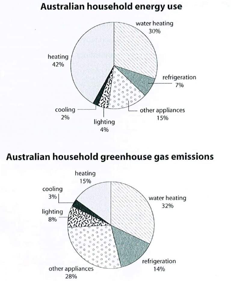
The 2 charts show the energy consumption of Australian household on average and the greenhouse gas emissions produced from the use of energy. Overall, Australian households use most of energy for heating and water heating and the use of energy for these purposes produce the highest percentage of greenhouse gas in Australia.
Looking at the first chart, heating consume 42%, the highest percentage of energy used by Australian household, and each household uses 30% of energy for water heating. In contrast, they use about 5% of energy for other purposes, including refrigeration, cooling and lightning, and 15% for other appliances.
Heating and water heating produce a half of the total greenhouse gas emissions in Australia, which is by far higher than greenhouse gas emissions from other energy-consumed purposes. Refrigeration generates as the same amount of greenhouse gas emissions as heating, 14%, while cooling produces the smallest percentage of greenhouse gas emissions, 3%.
IELTS CAMBRIDGE 10 TEST 2
You should spend about 20 minutes on this task.
The tables below give information about sales of Fairtrade-labelled coffee and bananas in 1999 and 2004 in five European countries.
Summarise the information by selecting and reporting the main features, and make comparisons where relevant.
MODEL ANSWER
Version 1
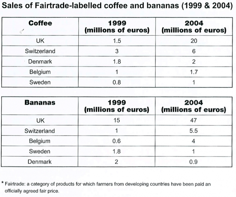
The two tables contain sales data for Fairtrade coffee and bananas in 1999 and 2004, in five nations of Europe.
The first table shows low-level coffee sales increasing in all five countries, albeit to widely varying degrees. In two places sales increased by the same small amount: 1.8-2 million euros in Denmark, and 0.8-1 million in Sweden. The increment was slightly larger in Belgium, from 1-1.7 million euros. Meanwhile, in Switzerland sales doubled from 3-6 million euros. Finally, in the UK there was an enormous increase, from 15-20 million euros.
In the second table, it is Switzerland which stands out as buying far more Fairtrade bananas than the other four countries. Swiss sales figures jumped from 15-47 million euros across these five years, while in the UK and Belgium sales only grew from 1-5.5 and from 0.6-4 million euros respectively. Sweden and Denmark showed a different pattern, with falls in banana sales from 1.8-1 and 2-0.9 million euros.
Comparing the two tables, it is clear that in 1999 Fairtrade coffee sales ranged from 0.8-3 million euros in these five countries, while banana sales also mostly clustered between 0.6 and 2 million euros, with Switzerland the outlier at a huge 15 million euros. By 2004, sales figures for both products had risen across the board, except for Sweden and Demark which recorded drops in banana sales.
Version 2
The tables show the amount of money spent on Fairtrade coffee and bananas in two separate years in the UK, Switzerland, Denmark, Belgium and Sweden.
It is clear that sales of Fairtrade coffee rose in all five European countries from 1999 to 2004, but sales of Fairtrade bananas only went up in three out of the five countries. Overall, the UK saw by far the highest levels of spending on the two products.
In 1999, Switzerland had the highest sales of Fairtrade coffee, at €3 million, while revenue from Fairtrade bananas was highest in the UK, at €15 million. By 2004, however, sales of Fairtrade coffee in the UK had risen to €20 million, and this was over three times higher than Switzerland’s sales figure for Fairtrade coffee in that year. The year 2004 also saw dramatic increases in the money spent on Fairtrade bananas in the UK and Switzerland, with revenues rising by €32 million and €4.5 million respectively.
Sales of the two Fairtrade products were far lower in Denmark, Belgium and Sweden. Small increases in sales of Fairtrade coffee can be seen, but revenue remained at €2 million or below in all three countries in both years. Finally, it is noticeable that the money spent on Fairtrade bananas actually fell in Belgium and Sweden.
IELTS CAMBRIDGE 10 TEST 3
You should spend about 20 minutes on this task.
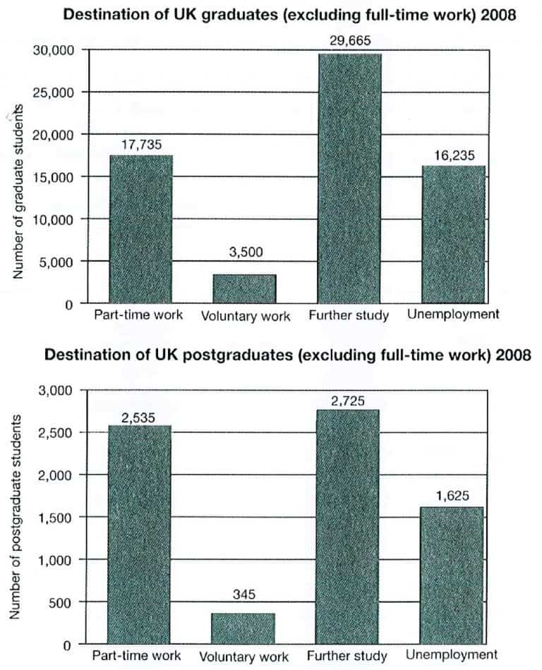
The charts below show what UK graduate and postgraduate students who did not go into full-time work did after leaving college in 2008
Summarise the information by selecting and reporting the main features, and make comparisons where relevant.
Write At least 150 words.
SAMPLE ANSWER
The 2 charts compares the option that UK graduates and postgraduates who did not work full-time chose after finishing college in 2008. In general, both UK graduate and postgraduate students were most likely to continue their study further while another most common options for postgraduates was part-time work.
In terms of graduates, 29,665 of those decided to study further, and this number was highest while the number of those who decided to become volunteers was lowest, at 3,500 students. Part-time job was chosen by nearly 18,000 graduate students; by contrast, just more than 16,000 students who were unemployed after their study completion at college.
In 2008, UK postgraduate students chose further study the most with 2,700 those choosing this option while the number of those got part-time jobs was slightly lower (approximately 2,500 students). By contrast, the number of postgraduate who faced unemployed was about 1600 whereas voluntary work was the least popular option for UK postgraduates with only 345 of those doing this.
IELTS CAMBRIDGE 10 TEST 4
You should spend about 20 minutes on this task.
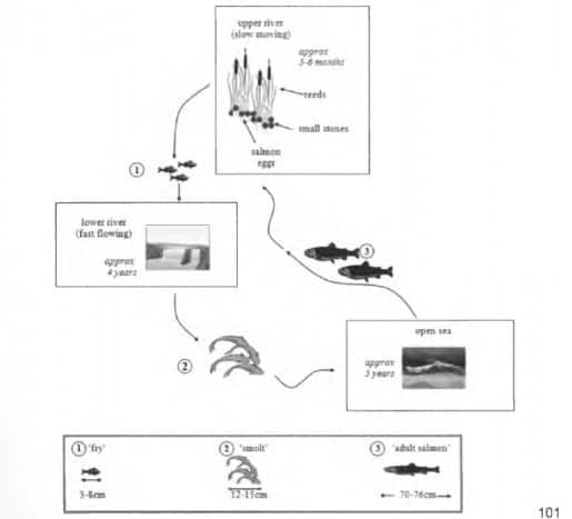
The diagrams below show the life cycle of a speicies of large fish called the salmon.
Summarise the information by selecting and reporting the main features, and make comparisons where relevant.
Write At least 150 words.
MODEL ANSWER
Salmon begin life as eggs on a pebbly riverbed, hidden among reeds in the slow-moving upper reaches of a river. After five to six months the eggs hatch into ‘fry’. For approximately the next four years, these baby salmon will live in the lower, faster-flowing waters of their river. During this time they measure between three and eight centimetres in length.
By the time salmon reach twelve to fifteen centimetres, they are termed ‘smolt’, and at this time they migrate further downriver into the open sea. After five years at sea the salmon will have grown to adult size, which is between seventy and seventy-six centimetres. They then begin swimming back to their birthplace, where they will lay their eggs, and the cycle starts anew.
In summary, the salmon passes through three distinct physical stages as it grows to maturity. Each of these stages takes place in a very different aquatic location. It is noteworthy that the first two stages of this fish’s life occur in a freshwater environment, while the third stage is lived in saltwater.
SAMPLE ANSWER AND MODEL ANSWER FOR CAMBRIDGE IELTS WRITING TASK 1 BOOK 11
Following are sample and model answers (band 7 or higher) for Cambridge IELTS Writing Task 1 Book 11
CAMBRIDGE IELTS WRITING TASK 1 BOOK 11 TEST 1
You should spend about 20 minutes on this task.
The charts below show the percentage of water used for different purposes in six areas of the world.
Summarize the information by selecting and reporting the main features, and make comparisons where relevant.
Write at least 150 words.
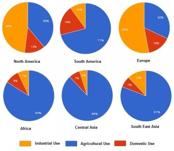
SAMPLE ANSWER 1
The 6 pie charts show how much water used for 3 purposes in 6 regions of the world. Globally, water is mostly used for agriculture while the least percentage of water goes to domestic sector.
71% of water is used for irrigation in South America, and over the proportion of water used for agricultural sector in Africa, Central Asia and Southeast Asia are over 80%. While the proportions of water for industry are lowest in Africa, Central Asia and South America, with from 5% to 10% of water is used for this purpose whereas the least proportion of water used for domestic is in Southeast Asia with 7%.
A half of water in North America and Europe is used for industrial use, which consumed the most of water. In these 2 areas, the proportions of water used for domestic purpose, which are around 15%, are lowest.
SAMPLE ANSWER 2
The 6 pie charts show how much water used for 3 purposes in 6 regions of the world. While the use of water is different in each part of the world, water is globally most used for agriculture.
71% of water is used for irrigation in South America, and the proportion of water used for agricultural sector in Africa, Central Asia and Southeast Asia are over 80%, which are the highest proportion of water in these areas. These numbers are by far higher than the proportion of water used for this sector in North America and Europe.
Regarding to industrial use of water, a half of the total amount of water in North America and Europe is used while the proportion of water for industry are lowest in Africa, Central Asia and South America, with only 5% to 10% water used. In contrast, the proportion of domestic used water is the lowest in North America, Europe and Southeast Asia.
IELTS CAMBRIDGE 11 TEST 2
You should spend about 20 minutes on this task.
The charts below show the proportions of British students at one university in England who were able to speak other languages in addition to English, in 2000 and 2010.
Summarise the information by selecting and reporting the main features and make comparisons where relevant.
Write at least 150 words.
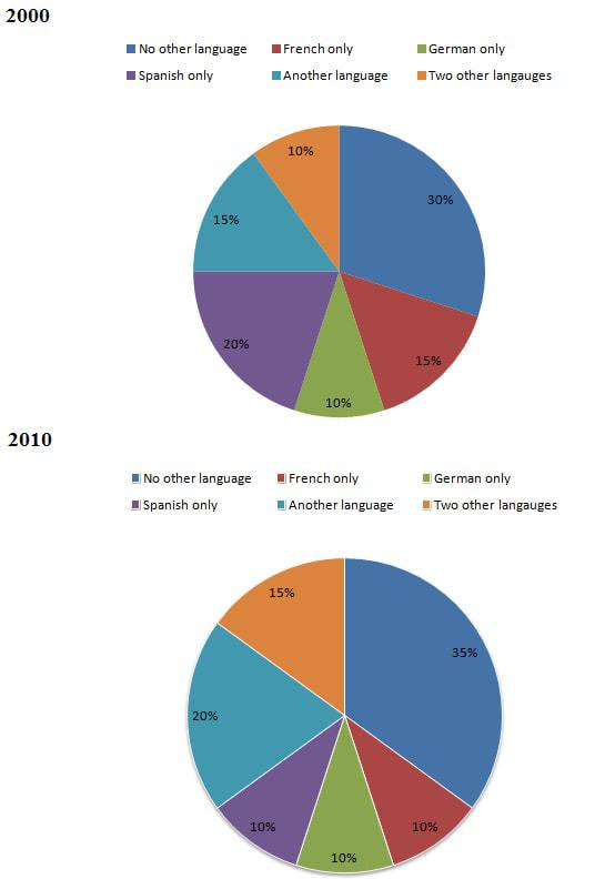
SAMPLE ANSWER
The charts show the proportion of British students in a university in England who are bilingual or multilingual in 2000 and 2010. Overall, while English speaking only students accounted for the highest proportion, the proportion of students who can speak French, or Spanish only decreased.
In 2000, 30% of students in this university can use their native language only, and this number was the highest. After a decade, students who are only able to speak English still dominated in this university, with 35% of students speaking this language only. The proportion of students who can communicate by two other languages raised from 10% to 15%.
After 10 years, the proportion of students who can use Spanish only halved to 10%, and the figure for those with French only also decreased to 10%. Over the period, only the proportion of students who are capable of speaking German only stayed static, in comparison with a rise of another language speakers in this university to 20%.
IELTS CAMBRIDGE 11 TEST 3
You should spend about 20 minutes on this task.
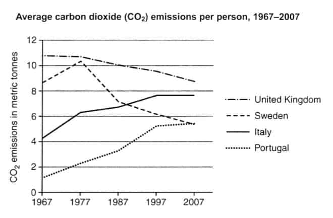
The graph below shows the average carbon dioxide (CO2) emissions per person in the United Kingdom, Sweden, Italy and Portugal between 1967 and 2007.
Summarise the information by selecting and reporting the main features, and make comparisons where relevant.
Write at least 150 words.
SAMPLE ANSWER
The graph shows how much carbon dioxide (CO2) emitted by each people in 4 countries from 1967 to 2000. Overall, while people in United Kingdom and Sweden released less emission, people in Italy and Portugal releases more CO2. British people were responsible for the largest amount of CO2 produced all the time.
In 1967, each person in the UK produced about 11 tonnes of CO2 emission on average, followed by 8 tonnes in Sweden. In the same year, the amounts of CO2 released by each Italian and Portuguese were 4 and under 2 tonnes, respectively.
In the next 40 years, the average amount of CO2 emission in the UK gradually fell to just over 8 tonnes. After an 1 tonne increase in the first ten years, the average amount of CO2 discharged by each person in Sweden went down to under 6 tonnes in 2007. In contrast, there was a rise in the emission in Italy and Portugal, with 8 tonnes of CO2 per head being produced in Italy in 2007 and the similar amount of CO2 to Sweden being released by each Portuguese in this year.
IELTS CAMBRIDGE 11 TEST 4
You should spend about 20 minutes on this task.
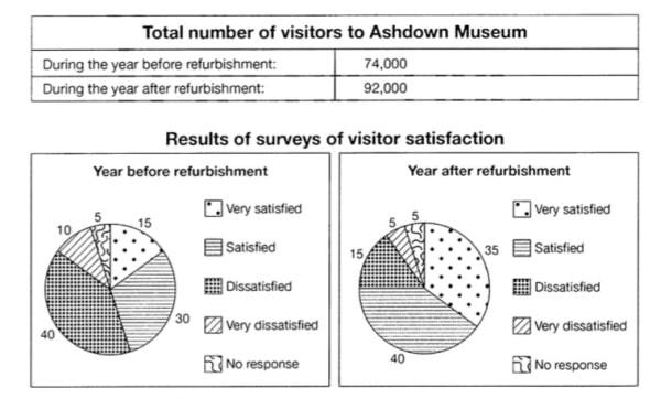
The table below shows the numbers of visitors to Ashdown Museum during the year before and the year after it was refurbished. The charts show the result of surveys asking visitors who satisfied they were with their visit, during the same two periods.
Summarise the information by selecting and reporting the main features and make comparison where relevant.
Write at least 150 words.
SAMPLE ANSWER
The charts and the table show how the refurbishment of Ashdown Museum affects the number of visitors and their satisfaction level.
Regarding to the total number of visitors, thanks to the refurbishment, the museum attracted more visitors. To be specific, this number climbed from 74,000 to 92,000 visits.
The refurbishment also raised the level of visitors’ satisfaction. In terms of the positive responses from visitors, only 15% of them were very satisfied, and 30% being satisfied with the museum before refurbishment. Then, the percentage of visitors describe the refurbished museum as very satisfied significantly increased to 35% and the figure for satisfied visitors is the largest percentage with 40% of them. In contrast, a half of visitors felt dissatisfied and very dissatisfied with Ashdown Museum before it was refurbished. However, after refurbishment, the percentage of visitor with low and very low satisfaction only accounted for smaller percentage, with 15% and 5%.
SAMPLE ANSWER AND MODEL ANSWER FOR CAMBRIDGE IELTS WRITING TASK 1 BOOK 12
Following are sample and model answers (band 7 or higher) for Cambridge IELTS Writing Task 1 Book 12
CAMBRIDGE IELTS WRITING TASK 1 BOOK 12 TEST 5
You should spend about 20 minutes on this task.
The bar chart below shows the percentage of Australian men and women in different age groups who did regular physical activity in 2010.
Summarise the information by selecting and reporting the main features, and make comparisons where relevant.
Write at least 150 words.
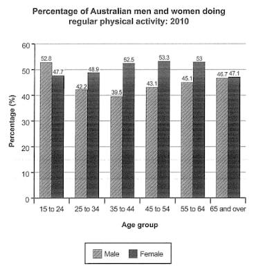
SAMPLE ANSWER 1
IELTS CAMBRIDGE 12 TEST 6
You should spend about 20 minutes on this task.
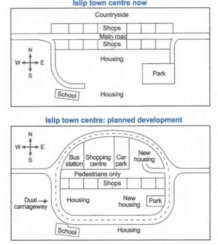
The maps below show the centre of a small town called Islip as it is now, and plans for its development.
Summarise the information by selecting and reporting the main features, and make comparisons where relevant.
Write at least 150 words.
SAMPLE ANSWER
The maps show how the centre of small town named Islip will change after a development plan. Overall, the town centre will look completely different with many new changes in infrastructure.
The current town centre is close to the countryside, which is to the north. There is a main road on east-west direction crosses the town, with 2 short lanes heading to the south side of the town. The lane in the west, leading to the housing area, curves a little in front of a school while the eastern one links main road with a park. There are two ranges of shops being along the side of the main road.
If developed, the town will be covered by a cycle of dual carriageway while the main road is planned to be restricted to pedestrian traffic only. Also, the plan shows that the northern row of shops will be reconstructed to a bus station, a shopping centre and a car park from west to east respectively while another one will remain unchanged. The school and park will remain as they are now exist; in contrast, 2 new residential areas will be built on the right of the car park and on the left of the park.
IELTS CAMBRIDGE 12 TEST 7
You should spend about 20 minutes on this task.
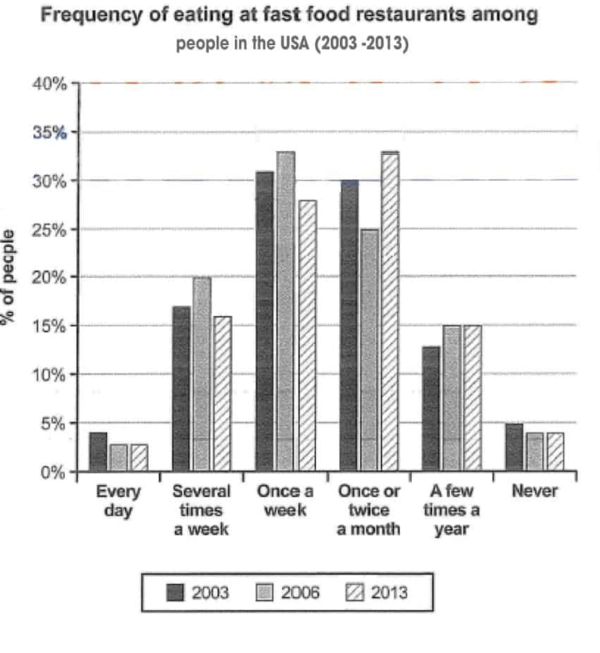
The chart below shows how frequently people in the USA ate in fast food restaurants between 2003 and 2013.
Summarise the information by selecting and reporting the main features, and make comparisons where relevant.
Write at least 150 words.
SAMPLE ANSWER
The bar chart compares how many times American people ate in fast food restaurant from 2003 to 2013. Overall, most people in the USA had meals at fast food restaurant once a week or once or twice a month, and the eating habits of American people did not change over the 10-year period.
In 2003, over 30% of American people ate in fast food once a week or once or twice a month, accounted for the highest proportions. In the next 10 years, the proportion of those in the once a week group increased slightly then dropped to around 25% while the opposite trends were true for those eating out in fast food restaurants. In 2013, the proportion of people eating at those sites once or twice a month was the highest, with 33% of American having this habit.
In contrast, around 15% of American ate several times a week or a few times a year while the figures for daily eaters or those who did not eat in those restaurants were about 5% in 2003. These frequencies did no change much change significantly during the period of 10 years.
IELTS CAMBRIDGE 12 TEST 8
You should spend about 20 minutes on this task.
The diagram below shows how geothermal energy is used to produce electricity.
Summarise the information by selecting and reporting the main features, and make comparisons where relevant.
Write at least 150 words.
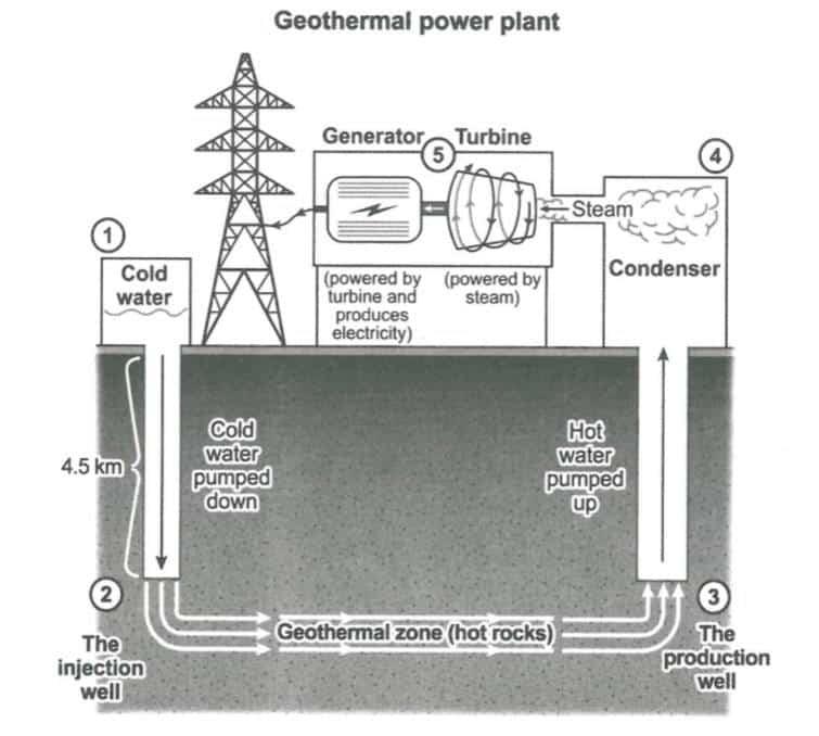
SAMPLE ANSWER
The process shows the process of generating electricity by using geothermal energy. It is clear that there are a total of 5 steps to produce electricity with 2 main stages, including treating water underground and making electricity in the power plant.
The process begins when cold water from a tank is pumped down 4.5 km underground to the injection well. In the next step, the water is injected into geothermal zone where it is heated with hot rocks. Once the water has been already heated up, it goes to the production well, then being pumped up to the condenser for the next stage.
In the power plant above ground, the heated water is transformed into steam in the condenser, then the steam flows into the turbine. When the turbine is rotated by the steam, it activates the generator to generate electricity which is transmitted to power poles.
PRACTICE FOR CAMBRIDGE IELTS WRITING TASK 1
Choose one or some of the tests above. Write your own answer. Comment it in this post (below). I will give you some feedback to improve your own writing.